Celebrating 15 Years
of Ingenuity & Excellence
of Ingenuity & Excellence
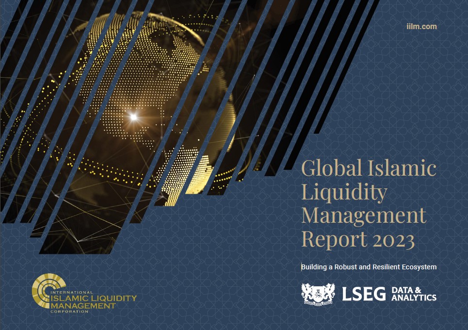
The IILM proudly marks its 15-year anniversary, commemorating a decade and a half as the one and only institution in the world dedicated to enhancing cross-border Islamic liquidity management for global financial institutions. As the most trusted and reliable issuer, the IILM continues to play a high-impact role in strengthening the relevance of Islamic finance globally. Since its inception, the IILM has been at the forefront of the industry with its highly regarded short-term Sukuk programme, a unique solution providing high-quality, Shariah-compliant liquidity instruments to financial institutions worldwide.
Challenges Facing Islamic Liquidity Management
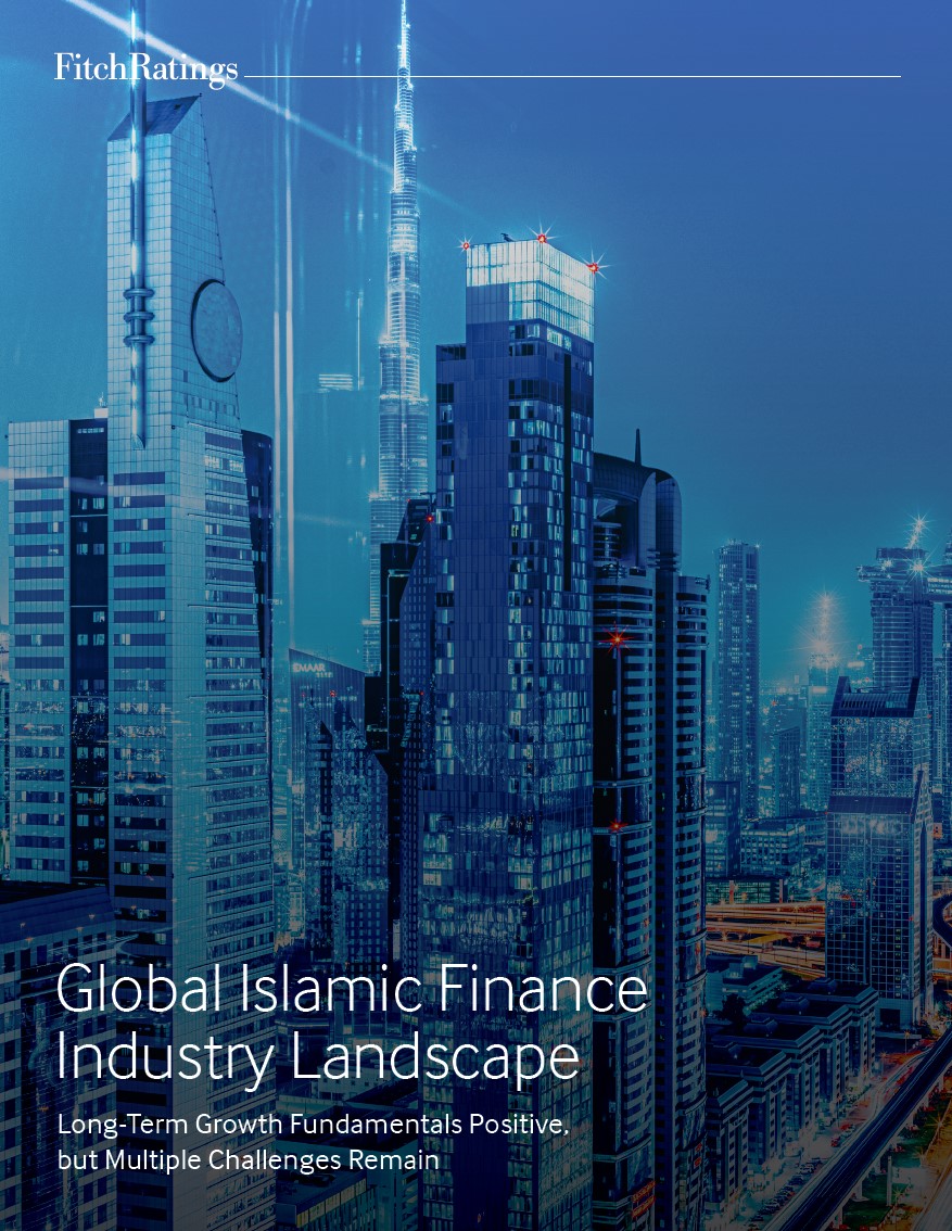
A set of factors collectively hinder the growth of Islamic liquidity management solutions that are both authentic to Islamic principles and commercially viable.
Challenges Facing Islamic Liquidity Management
A set of factors collectively hinder the growth of Islamic liquidity management solutions that are both authentic to Islamic principles and commercially viable.
WHO WE ARE
The International Islamic Liquidity Management Corporation (the IILM) is an international organisation established by central banks and a multilateral organisation to create and issue Shari’ah-compliant financial instruments to facilitate effective cross-border Islamic Liquidity Management.
Tool Used
Sukuk Issuance based on Wakala Structure.
Fully-compliant with AAOIFI Standards.
Objectives
Provide Shariah-compliant financial instruments for effective cross-border liquidity management.
Tool Used
Sukuk Issuance based on Wakala Structure.
Fully-compliant with AAOIFI Standards.
Objectives
Provide Shariah-compliant financial instruments for effective cross-border liquidity management.
SHAREHOLDERS
ACROSS THE GLOBE
ACROSS THE GLOBE
The IILM has a diverse membership comprising central banks of Indonesia, Kuwait, Malaysia, Mauritius, Nigeria, Qatar, Türkiye, the United Arab Emirates as well as Islamic Corporation for the Development of Private Sector (ICD), which paves the way for a unique collaborative, cross-border solution to a common, cross-border concern.
A TRUSTED NETWORK OF
PRIMARY DEALERS
PRIMARY DEALERS
The IILM’s short-term Sukῡk is distributed globally by a diversified network of international primary dealers, namely Abu Dhabi Islamic Bank, Al Baraka Turk, Affin Islamic Bank, Boubyan Bank, CIMB Islamic Bank Berhad, Dukhan Bank, First Abu Dhabi Bank, Kuwait Finance House, Maybank Islamic Berhad, Qatar Islamic Bank, and Standard Chartered Bank.
HOW WE
CAN WORK
TOGETHER
CAN WORK
TOGETHER
Investors seeking detailed insights into the IILM’s Sukuk programme are encouraged to connect with us. Our team is ready to provide comprehensive information on our Sharia-compliant financial instruments and their potential benefits for your portfolio. Contact us today to discover the strategic advantages of partnering with the IILM.
HOW WE CAN WORK
TOGETHER
TOGETHER
Investors seeking detailed insights into the IILM’s Sukuk programme are encouraged to connect with us. Our team is ready to provide comprehensive information on our Sharia-compliant financial instruments and their potential benefits for your portfolio. Contact us today to discover the strategic advantages of partnering with the IILM.
